Mobile Shopping &
Receipt Scanning
Helping Microsoft grow
Opportunity
I joined the Microsoft Shopping team and was tasked with improving the shopping experience within the Bing and Start mobile apps.
Along with feeds of deals and offers, users could scan their physical receipts and earn cash back offers for matching products and stores. This receipt scanning feature generated a considerable amount of engagement and traffic, and the shopping team wanted to highlight it further in order to continue growing mobile usage.
The existing experience
The design I inherited was built to be a mobile replica of the desktop web experience for Bing Shopping. Products with discounts were listed in curated categories mixed in with some unique mobile offers like gas offers, and receipt scan offers.
I felt that this design lacked focus, and didn’t serve the user very well.
Their intent, interests, history, or location weren’t taken into account.
The products and deals felt random and were rarely relevant.
When we shop, it’s usually with a goal in mind. Maybe you need a new shirt for a party, or your microwave just went out and you need a replacement.
The existing experience felt a bit like wandering aimlessly through an entire mall and hoping to magically bump into specifically what you needed.
Restructuring the content
After doing a content audit, I determined we could reorganize all the content into two main categories: In-Store offers (receipt scanning), and Online deals.
This allowed us to highlight our most interesting offers on the homepage while promoting receipt scanning, without losing access to the existing online deals and parity with the desktop web experience.
The navigation was made simpler and larger with a two-tab pivot control in order to draw more attention and make the hierarchy clearer.
New types of content categories were created in order to highlight limited time offers and create a reason to return frequently to the page. Categories were given different colors and styles in order to break up the feed and encourage the user to scroll and explore.
The most interesting, gamified categories were placed at the top of the feed with product categories seated below, since they drew less engagement.
These content categories were also updated to take into account user demographics, so we weren’t trying to sell diapers to college students, or cosmetics to older men.
Looking forward
Throughout the produce improvement process, I created and maintained a “North Star” vision design which incorporated our teams’ long term direction and goals. Some key improvements and new concepts were…
Expressive banners
The banner area was reworked to have a better use of space, full-bleed and more expressivity, giving events, new features, and brands the opportunity to have a bigger impact on the experience.
Location-based offers
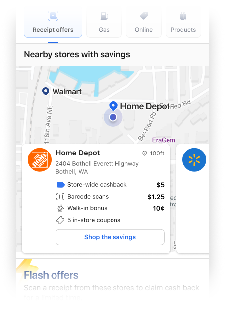
In-store shopping was given even more importance by leading the page with a map-view. This would highlight nearby stores and their relevant offers. A new user pattern would be created around checking the app before and after shopping, therefore driving more business to participating retailers and repeat engagement within the app.
Gamified offers
Limited-time, and limited-redemption offers would drive repeat visits and keep the app’s content fresh and ever-changing.
Results
With the North Star design as the vision, features, new categories, styling, and layout improvements were implemented in pieces throughout my time on the team in 2023.
Usage statistics continued to rise throughout the several months as we improved the app and added various features in different areas.
Monthly receipt submissions increased from ~400k to 5+ million during this time while monthly active users increased over 5x.


