LiveLike Mobile
Project Background
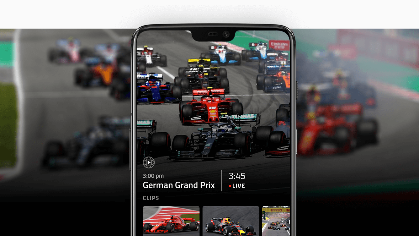
LiveLike creates innovative apps for experiencing sports in a brand new way. Different types of video like 180°, 360°, and multi-camera can all be watched while sharing the experience with your friends and interacting with stats.
I led the product design team’s efforts toward designing a new native mobile app, allowing our users to interact with our broad feature set in innovative new ways.
Challenge
LiveLike’s core product was initially designed for watching video in Virtual Reality, interacting with the UI only through head movements and gaze. In order to reach a broader market, the app was ported to mobile phones, but not much was changed in order to make it work well on touch screens.
Given the same broad feature set, how might we design a new product to fully take advantage of a smaller touch screen, keeping in mind how people use their phones to watch video content?
Decreasing the time-to-content and reducing user confusion were key metrics we hoped to achieve.
Process
Myself and 2 other designers had just 2 months in order to create an effective high-fidelity prototype to show interested clients and validate our ideas before development would begin. That gave us a pretty tight timeline to do everything we needed in order to crank out a killer user-focused app that represented all of our innovative features in a new way.
Requirement Gathering & Information Architecture
We talked to key stakeholders to find what existing features were necessary to include from the existing VR product.
Watch and explore 180° and 360° video, as well as existing rectilinear 2D content
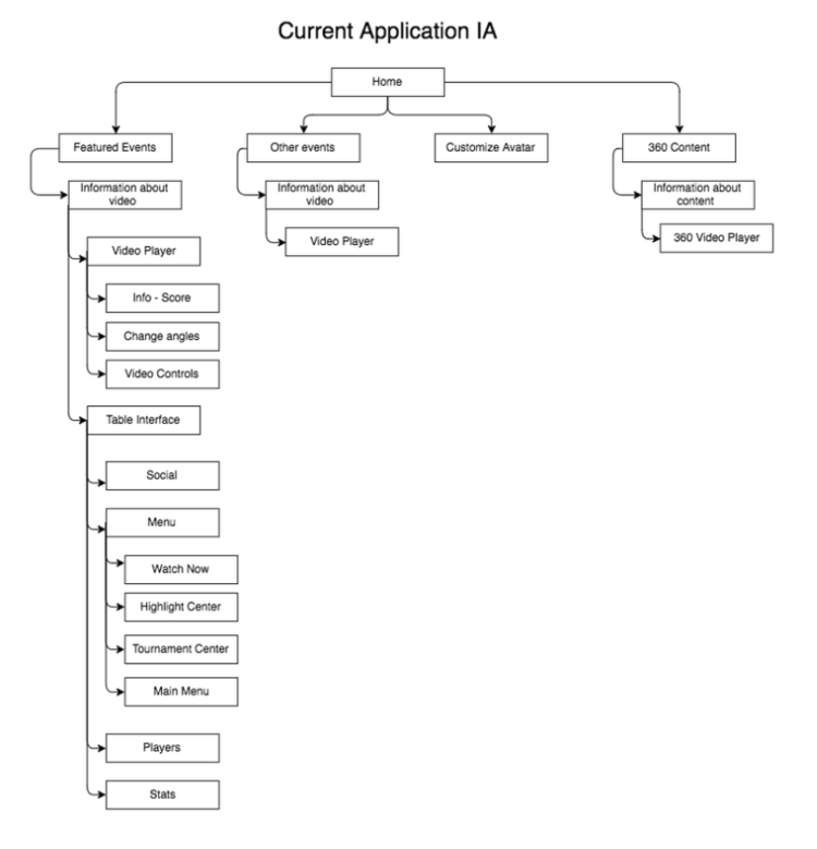
As a team we charted the existing information architecture and reorganized it so that content and features were grouped more logically.
Highlight related clips to show off the depth of the content catalog Provide related content and features within the video experience (clips, stats, player info, etc.)
Provide related content and features within the video experience (clips, stats, player info, etc.)
User Research
Our team reached out to sports fans who use their mobile phones for watching streaming video content. We gathered feedback on their needs, and their thoughts on our existing mobile apps to see where we could improve the user experience.
Key findings:
Video should always be the focus. Get people into content ASAP.
App should start in portrait mode, allow for landscape video watching at-will
Using established mobile design patterns is key
Competitive Analysis
For inspiration and also to gauge where other apps might be lacking, we gathered screenshots of other video and sports apps. As a group we discussed what we liked and what we didn’t, any new ideas that were sparked, and how we should move forward.
Seeing different navigational structures and ways of organizing content was super helpful. We found some cool ways of getting into video quickly, and showing related content without breaking immersion.
UX Brainstorming
Each team member created a handful of sketches and different concepts. We came back together as a group to discuss them and find ideas we liked.
The concepts ended up being centered around a few different themes:
Landscape-orientation with navigation happening in each edge-direction
Landscape-orientation with a slide-out sidebar
Starting portrait-orientation, eventually driving users into a landscape video experience
We all agreed that the portrait-focused concepts met the user needs the best. Users enter the app from their home screens in portrait-orientation and feel the most comfortable browsing with one hand. I went ahead to combine the best ideas into a single concept that we would prototype and test.
User testing the prototype
We tested with 3 users in order to get quick feedback and validate our ideas.
Key feedback:
Design feels clean and more in line with mobile design patterns
Video is too small in portrait mode
Content related to the video takes up too much space and detracts from the watching experience
Visual Design
I identified key screens and designed those first in order to start the discussion on our overall style and identify any problems with information hierarchy.
Video and time-to-content are the most important things to the experience. Because of this, I altered the design of the home page to have auto-playing video with a full background-takeover.
Related clips sit on top, showing the breadth of content available and creating a nice layered depth effect. If users want to scroll and explore around in the UI, the video resizes and sticks up-top but keeps playing so users don’t miss any key moment
After a general direction was decided, I defined a style guide and component toolkit to speed up the process and retain consistency across the project.
More features were added and iterated on in order to get the product to the level we needed for the prototype.
Final Prototype
Principle was used to create a high-fidelity prototype that testers could use on their mobile phone. This allowed for realistic experience and more valuable feedback.
Results
Our users loved the new design and felt that it worked much better as a mobile product. Testing found that they could access content much quicker and had an easier time finding features like statistics and video controls.
Our clients expressed enthusiastic interest and work has been moving forward on fully developing the key features of the app into an MVP product.


