LiveLike Producer CMS
Challenge
LiveLike’s new innovative mobile apps allow users to watch live video, chat with other fans, and use interactive “widgets” like polls, quizzes, and mini-games. The content owners needed new backend tools in order to create and manage these new features. Large catalogs of sporting events, widgets, chat rooms, and video feeds all require a centralized tool to make user engagement dynamic and rich. These tools need to be intuitive and quick to use within the fast-paced workflow of a live broadcast experience.
Requirement Gathering & Information Architecture
As a project team, we identified all the features necessary to the product. Features were prioritized according to their functional importance, as well as the needs of our clients who would eventually be the end users.
Easy to use in live video workflow
We met to share ideas and inspiration we had gathered from other products. These ranged from other Content Management Systems, to video editing software and analytics tools.
Very fast to publish widgets (select with 1-2 clicks, type with keyboard, submit)
Pre-populate or work on the fly
Image/content library
Chat stream preview
There were no other tools doing exactly what we planned, but we could glean some insights from different pieces of each product. Timelines were something especially interesting. Some products had a visual timeline running vertically or horizontally, while others decided to just sort their content in chronological order.
UX Ideation & Creation
With all the similar products and features in mind, I started by laying out the wireframes to identify the placement of key features. With each iteration, our product team discussed the layout of the page, navigational structure, and user flows in order to make things feel as fast as possible.
I designed the widget creation flow to use pop-up modals in order to create a fast-feeling workflow that’s easy to back out of if necessary. The user would first select a category, then be brought to a page with previews of each widget type. This would let the user see all their options and make an informed decision before any more navigation was needed. Upon selecting a widget, they could customize it as they want and save, schedule, or post it immediately.
Going through multiple pages in order to create a widget felt like it slowed down the process too much and made the flow less spontaneous. In the interest of continued simplification, the navigational structure of choosing widgets was flattened into a single page to avoid back buttons and breadcrumbs.
After ongoing discussion, the layout was continuously tweaked as new features were added or deemed unimportant. More space needed to be made in the Media Library for management tools. The concept of a visual timeline was removed entirely to simplify things and get us to a functional product faster.
Visual Design
After learning some new insights from user testing and feeling we were on the right track, I began refining the wireframes and moving into visual design.
Initial explorations into color and a light palette made the product feel way too bright, without an effective focus on widgets and chat in the visual hierarchy.
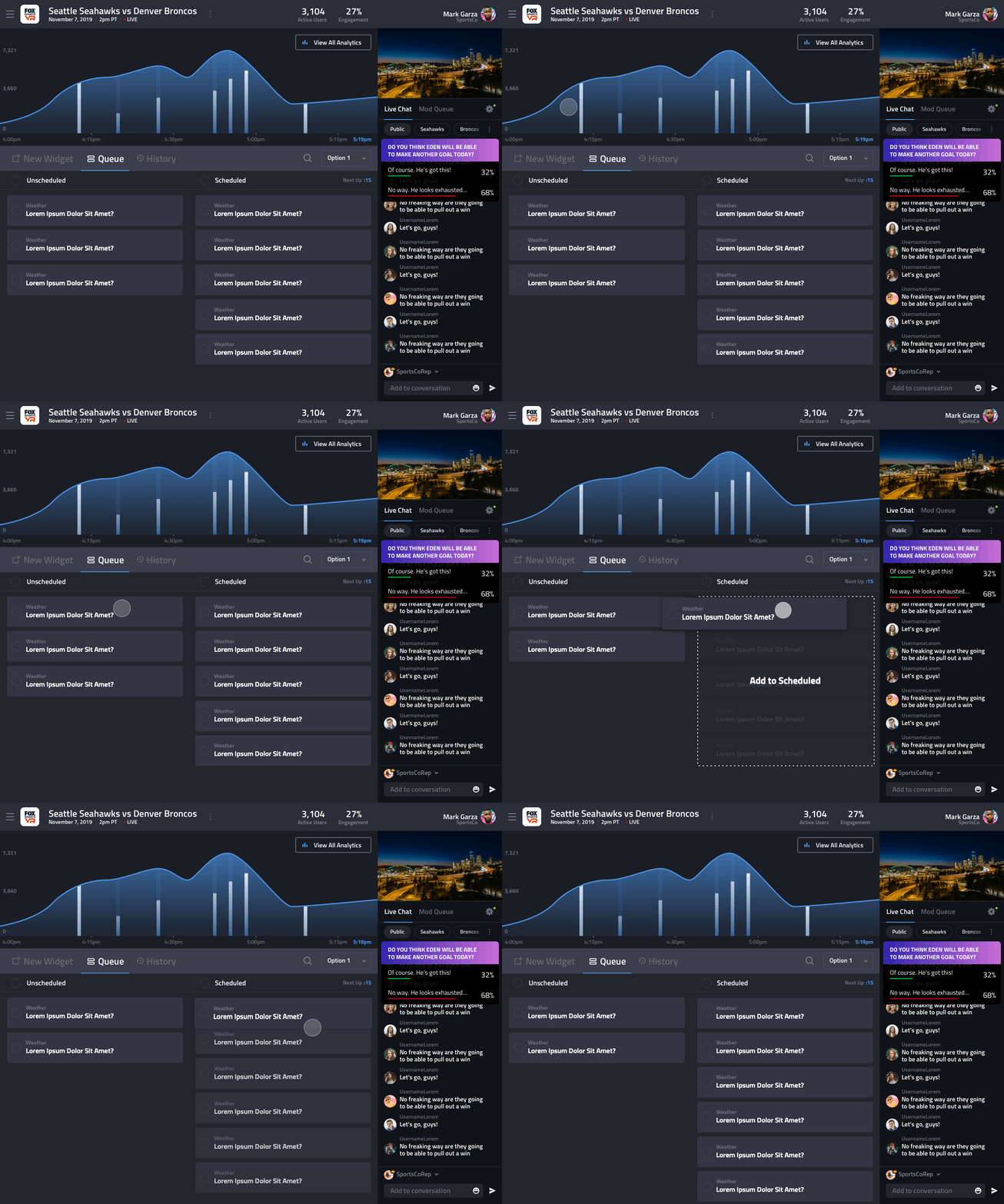
Looking back at the other product inspiration, I decided to move toward a dark color palette in order to feel more modern in the wake of the recent OSX Mojave updates, as well as design and production software moving toward darker UI. Dark UI lets content shine, strains the eye less when staring at the tool for long periods of time, and lets color effectively move the eye around the page.
Since there would be a lot of overlapping gray I established a harmonious scale of grays in order to allow for good contrast.
With the colors and type finalized, I defined the styles in Sketch and arranged all of the icons and components as symbols according to Atomic Design Theory.
Creating a design system allowed me to quickly create all the remaining screens using styles and components. These are some examples of key screens out of the 100+ I designed for the project.
Prototyping
A high-fidelity prototype was created with InVision. This was helpful in communicating user flows to developers, as well as A/B testing different navigational paths.
Animation
Whenever a piece of UI had possible animation, I would test out various types of motion using Principle. This helped validate ideas as well as convey the animations to developers effectively.


